Saturday, December 22
Tuesday, September 25
Space team
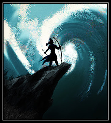
Yodha
A shot stayed in mind from Ramayana.. the Angy Rama ready to shed his anger on the sea god Varuna who doesn't hear his prayer for help ...the shot comes in Ramayana before the Vanaras started building the bridge to Lanka..
the story goes like..Varuna comes with apologies and helps them to make bridge easier...
This shot stayed back in mind for a long time after reading Ramayana..
C& C Welcome
.
the story goes like..Varuna comes with apologies and helps them to make bridge easier...
This shot stayed back in mind for a long time after reading Ramayana..

C& C Welcome
.
Monday, September 10
Rainbow Cloud-Walkthrough
Rainbow Cloud
.
Sky is the canvas of nature... i look up for inspiration whenever i am running out of it.. but yesterday it called me and told "get inspired child" :)
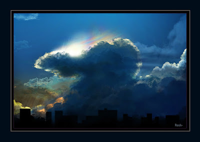
An attempt to capture a mesmerizing scene i saw recently in the nature's canvas to my photoshop canvas.... didn't wanted that realistic view..but in my own way...from memory... will try to put a real pic of the even as soon as i get one.
A quicky. Directly on photoshop with mouse. 2 hours work
Sky is the canvas of nature... i look up for inspiration whenever i am running out of it.. but yesterday it called me and told "get inspired child" :)

An attempt to capture a mesmerizing scene i saw recently in the nature's canvas to my photoshop canvas.... didn't wanted that realistic view..but in my own way...from memory...
A quicky. Directly on photoshop with mouse. 2 hours work
Wednesday, September 5
Jump like a Frog!
.
Well, it's clear in the title what i wanted to do.. it's now ur turn to tell me how much i succeeded to put that frog's character into this poor green guy... waiting for some critics.. Because it always helps in my development as an animator...
Well, it's clear in the title what i wanted to do.. it's now ur turn to tell me how much i succeeded to put that frog's character into this poor green guy... waiting for some critics.. Because it always helps in my development as an animator...
Another Bouncingball test
Here's a test animation i did with bouncing balls.. an attempt to try some flavor in timing, character attitudes..and other principles...
if it plays a bit fast, pardon me..it happened in my rendering..some trouble with the frame rate option i gave.. looks a bit fast in some machine..
if it plays a bit fast, pardon me..it happened in my rendering..some trouble with the frame rate option i gave.. looks a bit fast in some machine..
Tuesday, September 4
Creature of the Night- Non Scarry Version!
Thursday, August 30
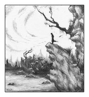
Man on the Rock....
.
well, This concept just came to me while doodling in some waste paper ..
As i started to like it, just did a better version in my sketch book and took it into photoshop as usual ...
just wanted to try different moods on the same image..and some colour studies too...
lemme know your comments
the pencil sketch....
Man on Rock - Aggressive thoughts...
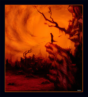
Man on Rock - Gloomy night...
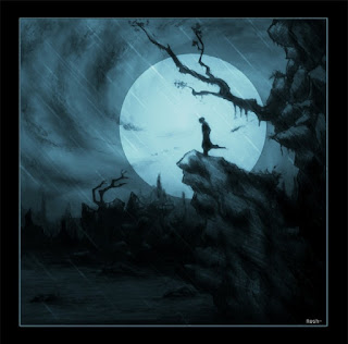
Comments always Welcome!!!!
well, This concept just came to me while doodling in some waste paper ..
As i started to like it, just did a better version in my sketch book and took it into photoshop as usual ...
just wanted to try different moods on the same image..and some colour studies too...
lemme know your comments
the pencil sketch....

Man on Rock - Aggressive thoughts...

Man on Rock - Gloomy night...

Comments always Welcome!!!!
Wednesday, August 1
Global Warming- The Beginning of the End.
Tuesday, July 31
"Inquisitive cosmic speck"
It's me..It's you..It's all of us...tiny human souls, looking at the universe... some of us look just to know how small we really are...and a few of us to know what is there for us to reach for...
the message : Aim high..Imagine...Explore.
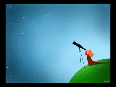
A little pic i dedicate to my dad who made me, and still making little kids around him, look up in and watch the night sky, the moon, meteors and comets ...He made us understand the most magical fairytale world is not far but just above your head...it's just, you have to look a bit high from your usual eye level.....
and I'm still looking! Finding that neverland...
the message : Aim high..Imagine...Explore.

A little pic i dedicate to my dad who made me, and still making little kids around him, look up in and watch the night sky, the moon, meteors and comets ...He made us understand the most magical fairytale world is not far but just above your head...it's just, you have to look a bit high from your usual eye level.....
and I'm still looking! Finding that neverland...
Sunday, July 15
Neova- The Assassin
The Girl with Neon hair. She darts in like an orange streak in the darkness and finish you before you know what hit you. Cold Blooded Killer. Inert to everything including emotions just like Neon. Named NEOVA.. Enjoy.
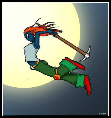
Done in paper with pen and pencil. scanned to photoshop..didn't find time to clean up the lines..colored using mouse ... and there she is..ready for the kill.
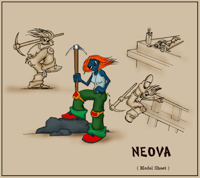
Comments Welcome.

Done in paper with pen and pencil. scanned to photoshop..didn't find time to clean up the lines..colored using mouse ... and there she is..ready for the kill.

Comments Welcome.
Saturday, July 14
Warrior Girl Design
Wednesday, July 11
A Wonderful Advertisement
i just found this while browzing the net. it's directed by Michael May.. Director of the Transformers,Bad boys and Armagadon. it's awesome, funny...Enjoy
michael bay
Saturday, July 7
Yethi- the snow man
Sleepless Night
Friday, June 15
Lost and Lonely
.
This one, I dedicate to my girl who lives too far from my reach ...... No big words attached to this post..but a few strong emotions...
Take a look and try to feel..that's the instructions for my viewers....
Lost and lonely......

And well, here's my Walk through to the final image as usual....
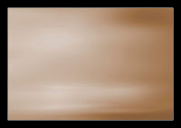
Started with a midtone filled brown canvas.... Using a low opacity brush painted in some spots where i need my lights to fall and reflect ... a slight motion blur filter on top gave me a good effect...
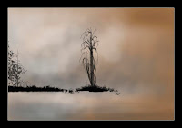
Roughly drew the main elements ..with a 50% opacity brush and black colour... mouse is ,as i always say, the hardest thing when u r drawing...
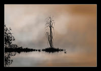
Worked on the details of the bush in the shore... it was nothing but the default leaf-brush-preset in photoshop.. played with various sizes and brush's angles ... ..merged the whole black parts to a new layer and turned it upside down to make the reflection... yeah, true, u r thinking right ...added motion blur ...
Same brush on the tree..went roughly..when i finished, duplicated the layer and put it with a darken-layer blend mode over the previous one with a slight Gaussian blur :).. it can't be so sharp in fog ..ha ha
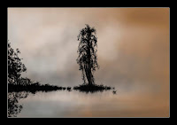
Nothing but detailing..detailing and detailing
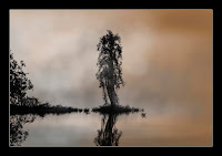
Well..merged the final image...added my secret filter.. lol ..from the artistic menu ... for the overall painting effect... and i'm into my favorite tool.... Hue/saturation.. this is where i always fix the mood of my drawings...
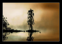
.a bit of level adjustment..a few touches on the curve tool and i'm done.. last part is signing my name underneath ...
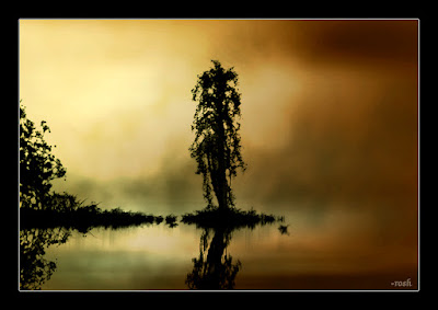
enjoy.
.rosh
This one, I dedicate to my girl who lives too far from my reach ...... No big words attached to this post..but a few strong emotions...
Take a look and try to feel..that's the instructions for my viewers....
Lost and lonely......

And well, here's my Walk through to the final image as usual....
Started with a midtone filled brown canvas.... Using a low opacity brush painted in some spots where i need my lights to fall and reflect ... a slight motion blur filter on top gave me a good effect...

Roughly drew the main elements ..with a 50% opacity brush and black colour... mouse is ,as i always say, the hardest thing when u r drawing...

Worked on the details of the bush in the shore... it was nothing but the default leaf-brush-preset in photoshop.. played with various sizes and brush's angles ... ..merged the whole black parts to a new layer and turned it upside down to make the reflection... yeah, true, u r thinking right ...added motion blur ...

Same brush on the tree..went roughly..when i finished, duplicated the layer and put it with a darken-layer blend mode over the previous one with a slight Gaussian blur :).. it can't be so sharp in fog ..ha ha

Nothing but detailing..detailing and detailing

Well..merged the final image...added my secret filter.. lol ..from the artistic menu ... for the overall painting effect... and i'm into my favorite tool.... Hue/saturation.. this is where i always fix the mood of my drawings...

.a bit of level adjustment..a few touches on the curve tool and i'm done.. last part is signing my name underneath ...

enjoy.
.rosh
Sunday, June 10
Absinthe- The Green Witch
.
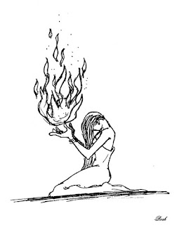
*Absinthe - If you don't know what it is, Google is at your service! This is a concept i took from a sketch of my friend Tarun. When the first time i saw this, i told him I'll paint it green..now i got the time and i worked on it.... btw, those who knows my favorite color is green might laugh, but i think this is the best color for this image .wot say?
(click on the image to see larger version)
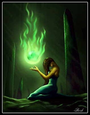
This is the first step. I have already stolen the concept from Tarun months ago.. this was my basic sketch on paper to begin photoshopping!
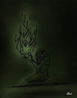
Dark green fill and highlights of green with a big low opacity brush...
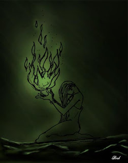
painted the foreground roughly...no time for detailing..just added a few lightrays to define where the light should be coming from and where the shadows should fall...
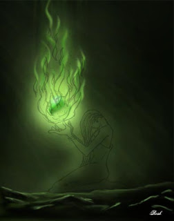
Time to start painting the Green flame.... just a few dots of different green shades blended with smudge tool did the trick ...
Painting the Witch...no green involved..just trying to get it the real human skin tone....
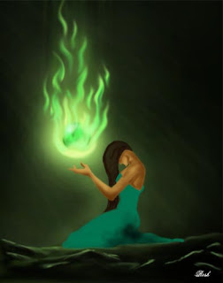
Time for detailing.. took a small brush and dark and light shades to paint in the details ,shadows and highlights...
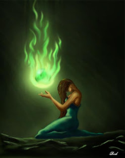
More detailing.....and added a little greenish tint to everything in there...
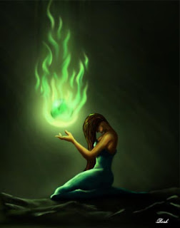
Well, it's all 2D now.. where's the depth... I almost forgot the 3D -ness of things.... well, what else i can do than adding something like a few pillars to show depth and blur !!!!
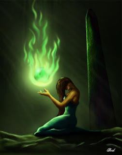
Yeah-u think right... just copy-pasted the first pillar and resized ... ! ..added a bit more high lights and shining of green to everywhere i thought necessary...
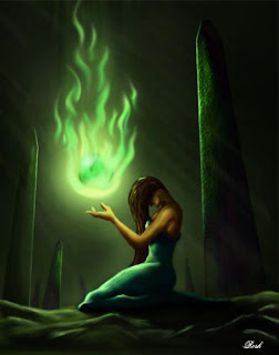
Done!!!!! I'm satisfied after doing some color correction and sharpen/blur/dodge/burn tools on the final image... nw, it's your turn to comment....
Absinthe is waiting to hear ...

thanks for watching !
*absinthe- Although it is sometimes mistakenly called a liqueur, absinthe is not bottled with added sugar and is, therefore, classified as a liquor or spirit
for image- click HERE
.
*Absinthe - If you don't know what it is, Google is at your service! This is a concept i took from a sketch of my friend Tarun. When the first time i saw this, i told him I'll paint it green..now i got the time and i worked on it.... btw, those who knows my favorite color is green might laugh, but i think this is the best color for this image .wot say?
(click on the image to see larger version)

This is the first step. I have already stolen the concept from Tarun months ago.. this was my basic sketch on paper to begin photoshopping!

Dark green fill and highlights of green with a big low opacity brush...

painted the foreground roughly...no time for detailing..just added a few lightrays to define where the light should be coming from and where the shadows should fall...

Time to start painting the Green flame.... just a few dots of different green shades blended with smudge tool did the trick ...

Painting the Witch...no green involved..just trying to get it the real human skin tone....

Time for detailing.. took a small brush and dark and light shades to paint in the details ,shadows and highlights...

More detailing.....and added a little greenish tint to everything in there...

Well, it's all 2D now.. where's the depth... I almost forgot the 3D -ness of things.... well, what else i can do than adding something like a few pillars to show depth and blur !!!!

Yeah-u think right... just copy-pasted the first pillar and resized ... ! ..added a bit more high lights and shining of green to everywhere i thought necessary...

Done!!!!! I'm satisfied after doing some color correction and sharpen/blur/dodge/burn tools on the final image... nw, it's your turn to comment....
Absinthe is waiting to hear ...

thanks for watching !
*absinthe- Although it is sometimes mistakenly called a liqueur, absinthe is not bottled with added sugar and is, therefore, classified as a liquor or spirit
for image- click HERE
.
Thursday, May 24
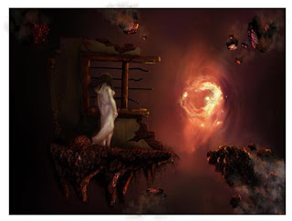
To the portal of Uncertainity...
Photoshop gimmicks continues......
(click on image for larger version)
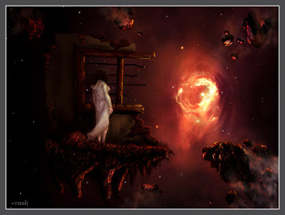
Another photoshop painting. I donno how the concept came to mind ...but when i drew it on paper ,i really wanted to work on it with photoshop. So, there gone my weekend ...but think it was worth spending two days.. wot u guyz think, any suggestions to improve? i knew my works sucks when it comes to detailing..but this time i've tried a lil more detail than usual...lemme know u'r comments... i've put a walk through of 'how i did it' with the pic ... hope u'd enjoy it ....
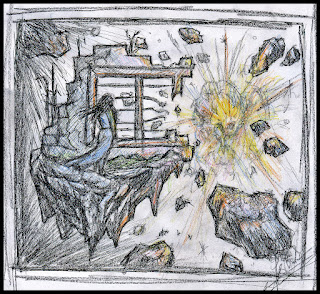
Here's where i started .... charcoal ,colour pencils and plain paper :)
Then started seting the main colour tone and mood of the scene in photoshop with a huge 5% opacity brush .....:)
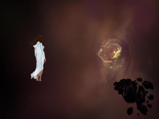
Drew the main elements ...the girl and the portal ..... with mouse .. (uh, wish i had a tablet! mouse sucks while drawing directly on screen)
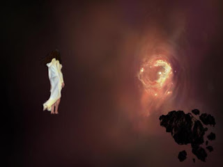
A bit more detailing ..then i avoided the girl and went into the portal (Zoom in) to do the detail with a 2 px low opacity brush :D... my whole Saturday gone with this part..
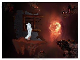
After the cleaning up and detailing of the portal, i started working on a piece of land whenre the girl should stand... i loved the look of the portal so locked the layer so that i wouldn't go in for more detail and mess it up as usual :D
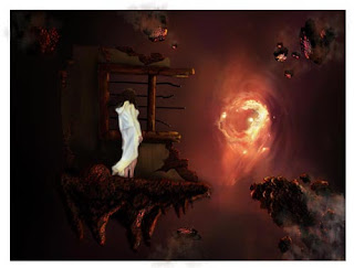
More cleaning up ...detailing..some textures to the land..adding a few smoke tails and detail to the rock pieces.... still the girl's costume looked too bright asif she was from some stupid detergent advertisement :)
Final touches.... by this time i merged most of the layers and the went in with the brush and smudge/sharpen toold to do the rest..adding some depth ,i call it :) ... also put some dirt and shadow on the girl's pure-white costumes... and now i am happy!! :)

Well, the final image comes out. a singlelayer.. the last part was colour manipulation... i really wanted the image to be a bit darker and the portal to look a bit more hot.. adding a bit of red tint did the trick and pulling some points in the curve editor gave me more dark/bright balance ..and i stopped working on it..... satisfied. happy. :)
well, nw waiting to hear what u guys think and what more i could add .....
thanx for reading all that crap and watching guyz. :)
(click on image for larger version)

Another photoshop painting. I donno how the concept came to mind ...but when i drew it on paper ,i really wanted to work on it with photoshop. So, there gone my weekend ...but think it was worth spending two days.. wot u guyz think, any suggestions to improve? i knew my works sucks when it comes to detailing..but this time i've tried a lil more detail than usual...lemme know u'r comments... i've put a walk through of 'how i did it' with the pic ... hope u'd enjoy it ....

Here's where i started .... charcoal ,colour pencils and plain paper :)

Then started seting the main colour tone and mood of the scene in photoshop with a huge 5% opacity brush .....:)

Drew the main elements ...the girl and the portal ..... with mouse .. (uh, wish i had a tablet! mouse sucks while drawing directly on screen)

A bit more detailing ..then i avoided the girl and went into the portal (Zoom in) to do the detail with a 2 px low opacity brush :D... my whole Saturday gone with this part..

After the cleaning up and detailing of the portal, i started working on a piece of land whenre the girl should stand... i loved the look of the portal so locked the layer so that i wouldn't go in for more detail and mess it up as usual :D

More cleaning up ...detailing..some textures to the land..adding a few smoke tails and detail to the rock pieces.... still the girl's costume looked too bright asif she was from some stupid detergent advertisement :)

Final touches.... by this time i merged most of the layers and the went in with the brush and smudge/sharpen toold to do the rest..adding some depth ,i call it :) ... also put some dirt and shadow on the girl's pure-white costumes... and now i am happy!! :)

Well, the final image comes out. a singlelayer.. the last part was colour manipulation... i really wanted the image to be a bit darker and the portal to look a bit more hot.. adding a bit of red tint did the trick and pulling some points in the curve editor gave me more dark/bright balance ..and i stopped working on it..... satisfied. happy. :)
well, nw waiting to hear what u guys think and what more i could add .....
thanx for reading all that crap and watching guyz. :)
Subscribe to:
Comments (Atom)


